In preparation for the upcoming Siege of Chicago, I've put my GIS skills to use by producing this map of potential defensive supply depots.
*Not responsible for any felony sub strikes

In preparation for the upcoming Siege of Chicago, I've put my GIS skills to use by producing this map of potential defensive supply depots.
*Not responsible for any felony sub strikes
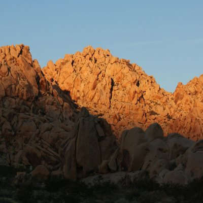
Helped deploy to the #PickettFire today in #Calistoga. Afternoon view from the ICP.
Duqm International Airport - Duqm, Oman
https://en.wikipedia.org/wiki/Duqm_Jaaluni_Airport
https://www.openstreetmap.org/#map=13/19.501944/57.634167
Colorado River Basin Has Lost As Much Water As A Full Lake Mead Since 2003, Study Says
--
https://www.kjzz.org/science/2025-05-30/colorado-river-basin-has-lost-as-much-water-as-a-full-lake-mead-since-2003-study-says <-- shared technical article
--
https://doi.org/10.1029/2025GL115593 <-- shared paper
--
#GIS #spatial #mapping #CRB #ColoradoRiver #ColoradoRiverbasin #Reservoir #lakeMead #lakePOwell #watersupply #waterstorage #drought #climatechange #groundwater #mining #depletion #remotesensing #NASA #GRACE #GRACEFO #satellite #water #hydrology #population #usecase #farming #irrigation #agriculture #watersecurity #foodsecurity #usage #model #modeling #landsurface #sustainability #sustainable #extraction #aridification
Dear ArcGIS Pro, and applications in general: if I’m in a browse dialog & quickly drilling into file paths before your stupid slow interface can fully initialize, please don’t subsequently refresh browse dialogs to defaults paths. Thx. #GIS
Colorado’s Subalpine Wetlands May Be Producing A Toxic Form Of Mercury – That’s A Concern For Downstream Water Supplies
--
https://theconversation.com/colorados-subalpine-wetlands-may-be-producing-a-toxic-form-of-mercury-thats-a-concern-for-downstream-water-supplies-259008 <-- shared technical article
--
https://doi.org/10.1088/1748-9326/add8a5 <-- shared paper / USGS publication
--
#GIS #spatial #mapping #natural #contamination #mercury #Colorado #wetlands #RockyMountains ##subalpine #waterquality #water #hydrology #watersupply #potable #risk #hazard #soils #methylmercury #heavymetal #wildlife #thaw #climatechange #neurotoxin #publichealth #Minamata #Niigata #Japan #bioaccumulation #sulfate #organic #common
#USGS
And the second:
And this one, which is a rare case of using vertical scrolling through the "page" as a way to effectively produce a slide deck mechanism --- a common trope in data journalism that I normally find annoying as shit --- effectively.
https://www.houstonchronicle.com/projects/2024/houston-arrow-homeless-encampments/
>A Houston Chronicle analysis found that, outside of downtown, Midtown and Memorial Park, Houston police officers are not writing the most tickets where the most homeless people live. They’re also not writing them solely in the areas that have been decommissioned. Instead, they’re writing them primarily in a swath of the city that radiates outward from downtown to the west – an area colloquially known as the “Houston arrow,” where the population tends to be wealthier, whiter and have better health outcomes.
I suspect the same pattern plays out in Austin, where wealthy Northwestern Austinites came out in force in favor of reinstating the camping ban there.
>Officials have focused on decommissioning encampments along major freeways.
Where the homeless are most visible.
>On a recent Tuesday, a list of people whom the church had given permission to stay on the porch was taped to the window of Lord of the Streets. But Brad Sullivan, vicar of Lord of the Streets, said that the church may not be able to shield people looking to sleep there for much longer. “I don’t want to be a bad neighbor to the folks in Midtown,” he said.
It's your neighbors who are bad, not you trying to help.
>Here is a map of median household income, with the highest earners represented by the deepest shades of purple. The high earners in neighborhoods west, northwest and southwest of downtown form an arrow shape: the "Houston Arrow." That is also where most of the encampment tickets were issued.
>
>The Houston Arrow also shows up when mapping race. Here the deeper shades of yellow are the areas with a higher concentration of white residents. Again, the encampment tickets match up with the arrow.
That map looks damn near identical to the map of Prop B election results in Austin in May 2021 (which reinstated, and *expanded*, the camping ban).
The map I included is by Eli Spencer Heyman, on Bluesky at @elium2.com@bsky.app. Alas, he is not on Mastodon. He has a website though:
A similar map was replicated by Jayaram Hariharan, who *is* on the Fediverse :D (though, sadly, he appears inactive)
https://jayaramhariharan.com/misc/atx-map/
https://github.com/elbeejay/ATX_PropB_Map
He also put his work up on Github, which is nice :)
Cool, one of my students just got a job specifically to use the stuff I taught him in my satellites to sensors GIS class last semester! #gis
Historical Fire Perimeters – Mapping – CalFire
--
https://www.fire.ca.gov/what-we-do/fire-resource-assessment-program/fire-perimeters <--shared resource
--
https://www.fire.ca.gov/what-we-do/fire-resource-assessment-program/fire-perimeters <-- current CalFire incidents
--
https://34c031f8-c9fd-4018-8c5a-4159cdff6b0d-cdn-endpoint.azureedge.net/-/media/calfire-website/what-we-do/fire-resource-assessment-program---frap/gis-data/2025/fire241gdb.ash'?rev=51177a999fe84e83a7c03b7d5a66b93b <-- download all data, GDB
--
#GIS #spatial #mapping #fire #CalFire #FRAP #resourcesassessmentprogram #fireperimeter #publiclands #privatelands #California #fedscience #fedservice #opendata #publicgood #database #risk #hazard #fireperimeter #asis #database #USFS #BLM #NPS #USFWS
Germany has a lot of roads called "Sackgasse" (dead-end road).
However, some of them have no dead ends at all. What a scam!
I've challenged myself to find them and used the resulting #Overpass query as an example in my workshop today at @FrOSCon.
https://overpass-turbo.eu/s/29ZE
(the query may need a minute to execute)
I have added a lot of comments to explain how it works, and I have added it to the example queries in the #OSM wiki.

 Did you know you can now find all streamgages and streamflow measurement locations in #Arizona in one place? Holland Elizabeth Goodrum Sterling provides an interactive online map of virtually every gage in the state, empowering smarter water resource management.
 Explore her dataset https://doi.org/10.25422/azu.data.25476031. Image: ESRI
#OpenData #OpenScience #GIS #WaterManagement #AZStreamCAT #UniversityofArizona
https://www.texasobserver.org/texas-house-dems-quorum-break-gerrymandering/
>While House Democrats in Chicago, plus some in New York, seem willing and able to withhold their numbers for the remaining weeks of this first 30-day special session, all that would do is delay the inevitable. In order to truly throw a wrench in the GOP’s machinations, Dems would likely have to keep their quorum break going through November, when the state opens up candidate filing for the 2026 elections.
>
>That would require maintaining an organized quorum break of more than 90 days—easily the longest in Texas history—through possibly three special sessions and under more punitive political conditions than ever.
90 days? That's it? That's peanuts.
>But Senate Democrats including Joe Manchin and Kyrsten Sinema were unmoved and the federal legislation did not budge. Meanwhile, as the days and weeks dragged on, Texas Democrats in exile grew weary, increasingly fractured, and eager for a political off-ramp.
It's not peanuts for Dems though. Absolutely spineless.
Can we *please* move to shortest-splitline districting? Expecting politicians not to gerrymander is laughable.
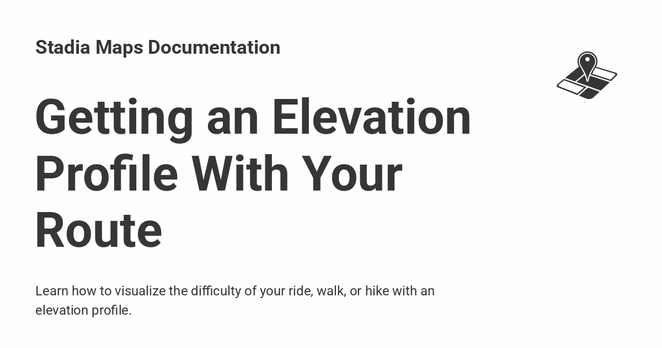
 Elevation-aware routing can help you seek or avoid challenging paths for bicycles, pedestrians, etc.
 And we make it easy to return elevation data for each leg of your route.
 Learn more in our tutorial: https://docs.stadiamaps.com/tutorials/getting-an-elevation-profile-with-your-route/?utm_campaign=tutorial_route_elevation&utm_source=mastodon&utm_medium=social
#routing #gis #mapping #maps
https://docs.stadiamaps.com/tutorials/getting-an-elevation-profile-with-your-route/?utm_campaign=tutorial_route_elevation&utm_source=mastodon&utm_medium=social
New ebook, #Nature Capital: #Mapping the value of nature by #EsriUK https://tinyurl.com/bdfsdr4s
#conservation #sustainability #biodiversity #GIS #esri #arcgis #GISchat #geospatial @esri @esrifederalgovt @esrislgov @esritraining @urisa
Im Dezember 2024 erschien ein Blogpost mit dem Titel "Straßenraumaufteilung in einer Online-Karte": https://geodaten-guerilla.net/blog/strassenraumaufteilung-online-karte
In diesem wurde beschrieben, wie sich eine Online-Karte erstellen lässt, in der die Aufteilung von Straßenräumen in der Stadt Kiel zu sehen ist. Zusätzlich lässt sich in dieser Karte die Stadt in "3D" erkunden.
Diese Karte hat sich nun weiterentwickelt (siehe Screenshot). Es sind 3D-Gebäudemodelle in LOD2-Qualität eingebunden. Das bedeutet zusätzlich Dächer, statt nur graue Blöcke als Gebäude.
Es sind Bäume eingebunden, die aus einem WFS der Stadt Kiel stammen und die Karte sehr viel lebendiger und wirklichkeitsnäher wirken lassen. Die Daten sind übrigens OpenData.
Link zum WFS (Lizenz CC-BY-4.0): https://ims.kiel.de/geodatenextern/services/Stadtplan/LHKielWmsWfs/MapServer/WfsServer
Die einzelnen Flächen der Straßen lassen sich nun anklicken. Dabei erfährt mensch, um was für einen Typ, bspw. Fahrbahn, Radweg, Parkplatz, es sich handelt.
Die Online-Karte wurde mit MapLibre erstellt und alle Daten werden als VectorTiles eingebunden.
Der Link zur Karte ist folgender: https://geodaten-guerilla.net/beta/
#introduction
(A new account for teaching/research stuff).
I teach wildlife and GIS courses at a field campus (State University of New York - College of Environmental Science and Forestry) in the Adirondack Park.
Most of my research focuses on bat conservation, bioacoustics, occupancy modeling, spatial analyses...but also involved in collaborative projects with trail cameras, bird research, etc.
Love to connect with other BIPOC in science.
#bats #wildlife #BIPOC #BioAcoustics #GIS
I have a question about mapping tools that can help with local activism/organizing/campaigns.
I am currently using Google Maps to plot individuals at various addresses. (Easy to import data to the map, I can share this with others, etc.)
But there is a problem. If there are multiple individuals with the same address, Google Maps only puts one pin at a given address...and no additional symbology/color to show you that more than one pin is plotted...even if you hover over it or click on it...only the top pin is shown.
What other mapping tools (that I can easily share with others) can properly display multiple pins at a given address?
(This question also opens the door to other features...can field operatives make updates in real time and share to a central data source/server?...and more and more.)
As always, for grass-roots stuff...free is best, lowest cost is next best.
Feel free to boost.
Thanks in advance!
Cool, satellite acquisition of the wave patterns of that small tsunami last week
FOSSGIS 2027: Call of Location! https://geoobserver.de/2025/08/08/fossgis-2027-call-of-location/ #fossgis #fossgis2027 #gistribe #gischat #foss4g #OSGeo #spatial #geospatial #opensource #DataViz #opendata #osm #openstreetmap #gis #geo #geoObserver pls RT @FOSSGIS_Konf
Imagine if there was a Guaranteed Income Supplement #GIS policy. Studies have shown they can have significant impact on reducing or eliminating poverty, with a minimum increase in government support payments because other disconnected programs can be discontinued. The percentage of people and children living in poverty would be reduced.


 Greg Cocks