shakedown.social is one of the many independent Mastodon servers you can use to participate in the fediverse.
A community for live music fans with roots in the jam scene. Shakedown Social is run by a team of volunteers (led by @clifff and @sethadam1) and funded by donations.

Administered by:

Server stats:

246
active users

#usability

1 post1 participant0 posts today

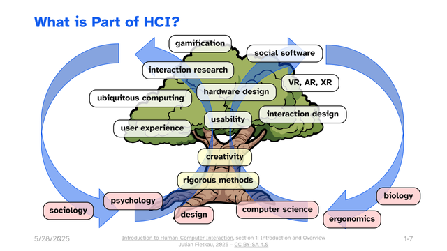
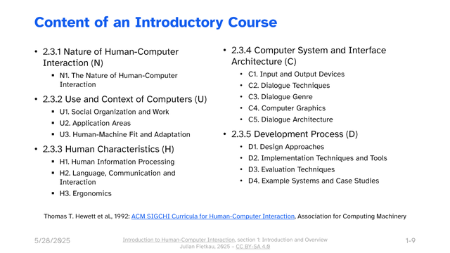
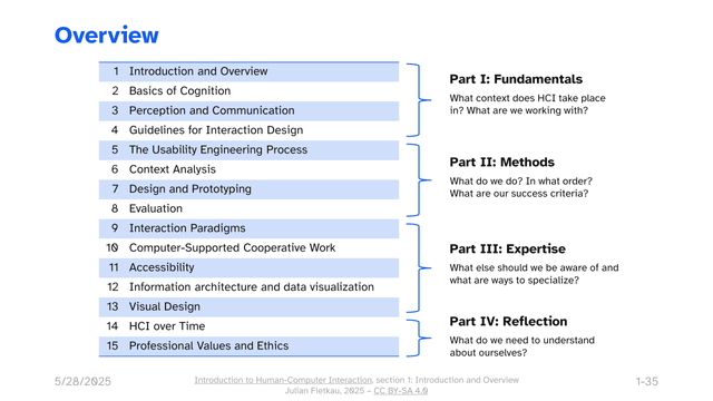
I've started publishing my “Introduction to human-computer interaction” slides as CC-licensed reusable teaching material. (My #OER debut!)

fietkau.science/teaching/intro

I've been wanting to share these for more than a year. Doing that all at once felt insurmountable, so now I'm putting them up piece by piece over the summer. 🙂 Two out of 15 sections are up and public now, feel free to browse!

If you follow me for fediverse stuff: this is my day job. 😄

Dear webmasters: If your website is multilingual and has language selection link somewhere, PLEASE make sure they actually take the user to the translated version of the current page, not just the homepage. It’s so frustrating because it forces the user to search for the translated page manually.

#Accessibility hive mind, I have some questions about #ChromeVox as well as #Chromebook accessibility & #usability in general. I'm working with a #PixelBook that has never been used. ChromeVox is telling me to use commands involving the search key as a modifier, but these seem not to work as any use of the search key invokes #Google #Gemini. What's going on here? Additionally, how are #blind people using #Chromebooks? In what tasks do they excel. In what tasks do they fall short? Any input and/or information would be greatly appreciated.

#Blind #BlindMasto #BlindMastodon #BlindFedi #a11y @mastoblind

I Want to Love Linux. It Doesn’t Love Me Back
fireborn.mataroa.blog/blog/i-w

by @fireborn

Read this article! I promise this is not another “I’ve tried Linux but it is too hard” post but a very insightful and well-written piece on accessibility across the Linux landscape.

fireborn.mataroa.blogI Want to Love Linux. It Doesn’t Love Me Back: Post 1 – Built for Control, But Not for People — fireborn
Continued thread

And look, I get it, git’s commands make perfect sense (and, dare I say, are elegant) if one thinks in directed acyclic graphs. The challenge is creating interfaces for all the folks who don’t think in directed acyclic graphs. Or, in simpler terms, a note from one of my earlier talks on design: “Your app shouldn’t look like your database just threw up.”

Which leads us to the difference between inside-out and outside-in design…

More: ar.al/talks/#superheroes-and-v

Aral BalkanTalksI’ve given hundreds of talks over the last two decades and beyond. Here are a few of my favourites in chronological order so you can see how my focus and thoughts have evolved through the years. I hope you enjoy them. PS. If you want me to speak about the Small Web at your event, feel free to send a short message to mail@ar.al with the details. PPS. You can see Laura and me live every third Thursday of the month on Small is Beautiful, which we stream from our own Owncast server.

#Web #usability and #accessibility ...

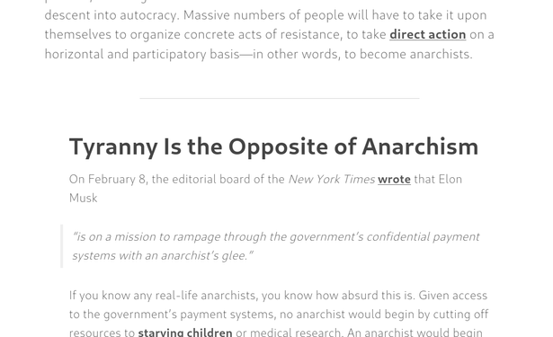
This is from crimethinc.com, but I'm not trying to pick particularly on them. There are many, many, many sites just as bad or worse.

This is a screenshot from an article on their site today, rendered in Firefox (Linux).

See the hair-thin font? See the fact that it's light grey on a white background? There's virtually no contrast between the text and the background.

This is an accessibility nightmare for those with any sort of vision problem. Picking the colour out of the screenshot (I didn't look at the CSS), it appears the text is basically 45% grey. This is ludicrous.

If the font face had some heft, it might be still be half-assed readable with contrast this low.

But as is... If I were to take my contacts out, I wouldn't even be able to tell that this screenshot *had* any of the normal-sized text in it, much less be able to read any of it.

Web designers, I beg you: please consider more than the appearance of what you're creating when you're making design choices.

Remember that not everyone is a 20- or 30-something with near-perfect vision.

Remember that people have cataracts or other types of eye cloudiness which necessitate high-contrast text to be able to read, even if they scale the fonts up by a huge amount.

Remember that vision degrades naturally in people in many ways other than "just wear glasses" can fix.

In #Munich, the surface metro is called "S"-Bahn and the underground is the "U"-Bahn. There's this elevator on my way to work that has these three buttons: "O", "S" and "U". Which one would you pick to get to the "S"-trains when you're coming from the "U"-trains?

Over and over I've seen tourists with suitcases make the wrong choice in this elevator. It bothered me so much that I've printed a label to fix the #UX of this #usability disaster.

It's been there for 2 weeks now ✌️

Recent datepicker experience:
1. Control is presented as three separate spin controls, supporting the Up/Down Arrow keys to increment and decrement the value as well as manual typing. But because they're not text inputs, I can't use the Left/Right Arrow keys to review what each separate one contains, only to move between day, month, and year.
2. I tab to year.
3. I press Down Arrow, and the value is set to 2075. I'm unclear how many use cases require the year to be frequently set to 2075, but I can't imagine it's many so this seems like a fairly ridiculous starting point.
4. I press Up Arrow, and the value gets set to 0001. The number of applications for which 0001 is a valid year is likewise vanishingly small.
5. I delete the 0001, at which point my #screenReader reports that the current value is "0". Also not a valid year.
6. Out of curiosity, I inspect the element to see which third-party component is being used to create this mess... only to find that it's a native `<input>` with `type="date"` and this is just how Google Chrome presents it.

A good reminder that #HTML is not always the most #accessible or user-friendly.

Microsoft war mal Vorreiter bei UX & Usability. Die Älteren unter uns erinnern sich noch.

Dieses Fenster kommt beim PC-Start und enthält keine klickbaren Elemente.

❌ Angemessene / dynamische Schriftgröße
❌ Textumbruch
❌ Scroll-Leisten
❌ Kontrast und Ausrichtung des Fenstertitels
❌ 1px-Rahmen zum Vergrößern

Das muss wohl dieses Copilot-Vibe-Coding sein!

(ja, dieses Windows ist auf 100% Textskalierung eingestellt!)

Continued thread

It seems that #Scrum / #SAFe websites are terribly afraid of C&P and are perfectly fine throwing #Usability and #UX out of the window

framework.scaledagile.com/ adds a multi-line html formatted copyright notice to anything you copy

var pagelink = "
© Scaled Agile, Inc. ...";
var copytext = selection + pagelink;

🤬

Scaled Agile FrameworkFramework - Scaled Agile FrameworkSAFe 6 is an update to the SAFe Framework to help organizations become Lean Enterprise and achieve Business Agility. Learn more and see FAQs about 6.

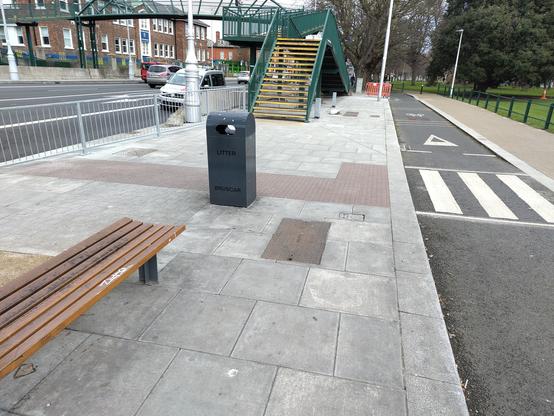
Brand new infrastructure in Fairview, Dublin. Zebra crossing over cycle path. Onto that knobbly surface for blind users, to show them pedestrian crossings. This surface guides them past the footbridge and into a crossing that doesn't exist over a 5 lane road. The non crossing also has a barrier, directly in front of them. It's a disgrace
#dublin #usability #accessibility #urbanDesign

New washing machine was installed yesterday and today I’m seriously considering making a spreadsheet of all the programmes. Or maybe an iPhone app.

30 years ago on my Human-Computer Interaction post-grad we studied the usability failings of VCRs. It appears that washing machines are the rightful heir to this infamy.

The manufacturer is clearly aware of this as the machine has a “fuck it / don’t care” button.