shakedown.social is one of the many independent Mastodon servers you can use to participate in the fediverse.
A community for live music fans with roots in the jam scene. Shakedown Social is run by a team of volunteers (led by @clifff and @sethadam1) and funded by donations.

Administered by:

Server stats:

289
active users

#fonts

6 posts6 participants0 posts today
Continued thread

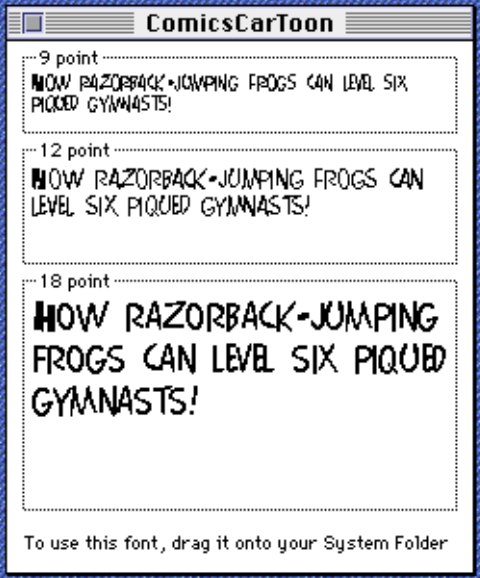
We are honored to publish Emigre Fonts: Type Specimens, 1986–2024, a compendium of specimens spanning forty years of type innovation from the legendary Bay Area foundry. Preview a selection from the book’s 1,200+ pages—and read a foreword from Associate Curator Stephen Coles on the importance of the Emigre archive to the mission of Letterform Archive: letterformarchive.org/news/ins

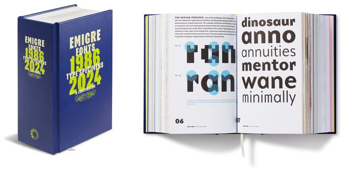
Letterform Archive · Inside Emigre Fonts, Type Specimens, 1986–2024With 40 complete type specimens packed into 5 pounds, this compendium documents the output of one of the earliest (and most prolific) digital type foundries. Here’s a peek at the book’s foreword.

The Evolution of Classical Chinese Characters and their Pronunciation in Mandarin.
古漢字字形演變及其官話讀音。
youtu.be/EbxohNCoJHM?si=M4jpuP
Having noticed someone inquiring about classical Chinese bronze inscription characters on Facebook, I therefore recorded a video to illustrate them.
適見Facebook有客詢商周金文,吾遂錄像以闡之。

youtu.be- YouTubeEnjoy the videos and music you love, upload original content, and share it all with friends, family, and the world on YouTube.

Franklin Type Foundry, Convenient Book of Specimens, Cincinnati, 1892

Hello, spring. (For our friends in the Northern Hemisphere.)

You may know Century Expanded, or Century Schoolbook, but here’s a lesser-known, earlier Century. Franklin, established in 1856, is one of the first foundries in the US. It was folded into American Type Founders, along with 22 other companies, in 1892.

I’m a simple man. I like my beer cold, my zeros slashed, and my strokes serifed.

(Serifed programming fonts are surprisingly rare compared to their naked cousins.)

(And dotted zeros look like nipples. There. I said it.)

Continued thread

Thanks for all the suggestions; I forgot to mention that its not for code editing but for reading, mostly on the browser. A new pain point is the rn/m confusion at small points (8-12). Any non code Sans Serif font that makes this really discernible?

Why I 🧡 the web.

An offline-capable Notepad (also a Progressive Web App) that's been operating for 9 years. 🗒️

👉🏻 Dark mode.
👉🏻 Privacy-focused
👉🏻 Full-screen mode
👉🏻 Supports monospaced and dyslexic #fonts.
👉🏻 Floating window
👉🏻 Download notes as plain text, #PDF, and DOCX.

notepad.js.org/

notepad.js.orgNotepad - Offline capableAn offline capable notepad powered by ServiceWorker. It's quick, distraction-free, dark mode enabled, mobile compatible(Android, iOS) and minimalist in nature.

#Fediverse, I need your help again!
tl; dr: I need a font maker software!

I'd like to convert my handwriting into a font for my research output, as I'd like to maintain my personal handwriting in my sketchnotes but I'd like the written notes to be text.
I'm already very familiar with vector graphics and lettering but never made a font so would love an open source/free font design software to start.

I’m curious what font Hagerty uses for their collateral. This font looks almost like Trade Gothic, but that’s not quite right. The combination of that odd terminal on the e, the sloped top of the t, the square dot on the i, and the double-counter g is downright unique.

Truly enjoyed this week's #Tedium @tedium by @ernie

I actually have Bell Centennial still installed from the days when Penny and I owned our newspapers. We used the fonts in our display advertising and "enhanced" classified ads.

I load the old font archive onto every new computer I get. #font #Fonts

There is something beautiful and magical about fonts. A true work of art. A world where art and text collide.

🔗 Tiny Type On Yellow Pages
Why AT&T had to redesign its primary phone-book font in the late 1970s to keep with the times, and the clever typographical trick it used.

tedium.co/2025/03/05/phone-boo

Tedium: The Dull Side of the Internet.Phone Book Fonts: Why Bell Centennial Beat Out Bell GothicWhy AT&T had to redesign its primary phone-book font in the late 1970s to keep with the times, and the clever typographical trick it used.