"Eventually, I stopped responding to my body. I was responding instead to a dashboard." — @Daojoan
This is a great point and very much translates to so many other parts of life/work where people stop listening to their "body" (or to their org/product/offering), outsourcing/numbing/dumbing down their decision making based on dashboards of collected metrics and then changing their behaviors on auto-pilot to improve said metrics — without ever asking themselves if the data collected actually represents answers to the right (or even important) questions...
Metrics always invite comparison & competition — on a global scale — often without considering our own subjective contexts/needs/limits/aims...
Does the number of copilot prompts per day on a CTO dashboard indicate a highly productive developer or does a big fat zero merely show a different approach to problem solving?
Does the lack of constant updates to a FLOSS project mean it's become neglected/unusable or does it simply indicate it reached a level of stability?
Likewise, does my product/app need constant UI changes/updates to "streamline" user experience (often without even consulting users) based on some "goal" metrics?
Am I seen as an unproductive FLOSS developer if my public commit log doesn't show daily updates? Do gaps indicate laziness, illness, deep thinking or work on other projects? Like gaps in a CV, will these gaps of activity data hinder future employment chances or would I even want to work with orgs who select on this criteria?
Is a hike only good/better because it exceeds X kilometers or Y elevation meters? How does one measure the stunning views or the quality of the company which shared that experience?
https://www.joanwestenberg.com/why-i-gave-up-my-smartwatch/


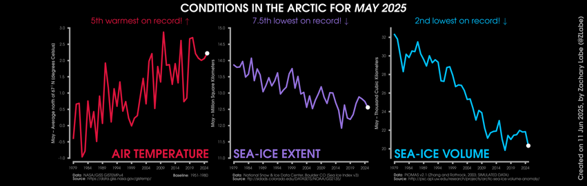

![Chart: Est. U.S. Variant Proportions by Common Name
Sources: CDC, Cov-Lineages, NYITCOM, others
[ beadsland on Ko-fi ]
Reskin of CDC's Variants Nowcast, and any significant variants in GISAID not broken out by CDC.
Five bar-style tree-charts, for fortnights through 5/25–6/7. Legend of last fortnight, organized by subheadings of color-grouped families and convergent clusters. Percentages overlay each color key, reflecting share as of most recent tree-chart.
For 5/11–5/24, packed bubble charts fill single-variant tiles, reflecting GISAID detail not shown by CDC's Nowcast.
Legend:
JN.1.11 + FLiRT31 [red]:
38% - LP.8.1.1 / NY† & other FDA-Vaccine-Target LP.8.1
Omicron-2 BA.2 [brown]:
37% - Nimbus NB.1.8.1 / PQ
WHO-Vaccine-Target [greens]:
8% - XFG.2† & other XFG
7% - XFC
4% - LF.7.9.1 / PY† & other LF.7.9
2% - XEC, LB.1.3.1 / NL & XEC.4
1% - LF.7.7.2 & LF.7.7.1 / PV
⁹⁄₁₀% - other LF.7
JN.1.11 [blues]:
⅜% - KP.3 & XEQ
1% - PA.1, MC.10.1, MC.1 & other KP.3.1.1 / MC
JN.1.11 + FLiRT31 [purple]:
⅛% - XEK
Other [grey]:
0% - Other (not specified)
_____
Nimbus NB.1.8.1 / PQ is a scion of left-field Razor-Blade-Throat XDV.
Razor-Blade-Throat XDV was a child of Winter 2024's WHO-Vaccine-Target JN.1 and left-field recombinant XDE.
XDE was a child of left-field Hyperion grandkid FL.13.4 and left-field Hippogryph scion GW.5.1.
XFG is a child of April's JN.1.16.1 kid LF.7 and newish FLiRT31 cluster LP.8.1.2.
[Some footnotes omitted, due to too many recombinants.]](https://spaces.hcommons.social/media_attachments/files/114/662/748/663/611/226/original/4daa304293c78070.jpg "Chart: Est. U.S. Variant Proportions by Common Name
Sources: CDC, Cov-Lineages, NYITCOM, others
[ beadsland on Ko-fi ]
Reskin of CDC's Variants Nowcast, and any significant variants in GISAID not broken out by CDC.
Five bar-style tree-charts, for fortnights through 5/25–6/7. Legend of last fortnight, organized by subheadings of color-grouped families and convergent clusters. Percentages overlay each color key, reflecting share as of most recent tree-chart.
For 5/11–5/24, packed bubble charts fill single-variant tiles, reflecting GISAID detail not shown by CDC's Nowcast.
Legend:
JN.1.11 + FLiRT31 [red]:
38% - LP.8.1.1 / NY† & other FDA-Vaccine-Target LP.8.1
Omicron-2 BA.2 [brown]:
37% - Nimbus NB.1.8.1 / PQ
WHO-Vaccine-Target [greens]:
8% - XFG.2† & other XFG
7% - XFC
4% - LF.7.9.1 / PY† & other LF.7.9
2% - XEC, LB.1.3.1 / NL & XEC.4
1% - LF.7.7.2 & LF.7.7.1 / PV
⁹⁄₁₀% - other LF.7
JN.1.11 [blues]:
⅜% - KP.3 & XEQ
1% - PA.1, MC.10.1, MC.1 & other KP.3.1.1 / MC
JN.1.11 + FLiRT31 [purple]:
⅛% - XEK
Other [grey]:
0% - Other (not specified)
_____
Nimbus NB.1.8.1 / PQ is a scion of left-field Razor-Blade-Throat XDV.
Razor-Blade-Throat XDV was a child of Winter 2024's WHO-Vaccine-Target JN.1 and left-field recombinant XDE.
XDE was a child of left-field Hyperion grandkid FL.13.4 and left-field Hippogryph scion GW.5.1.
XFG is a child of April's JN.1.16.1 kid LF.7 and newish FLiRT31 cluster LP.8.1.2.
[Some footnotes omitted, due to too many recombinants.]")


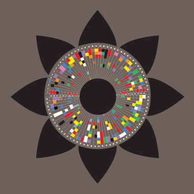
![Chart: Annoplot Dataviz Library*: Project Profile
Subtitle: 11.3K lines† across component modules and significant submodules.
Multi-level pie chart organized into six major categories by color. Each outer wedge shows a tally of number of lines for that sub-component.
Green variants wedges all variously exploded out; also, less so, blue artists/legend wedges.
A legend is split across both sides of the chart. Each key mirrors one of the wedges on the dual pie chart, along with a sentence or two description of each (sub)component thereby represented.
Caption:
* Pre-release development version 2025-06-05.
† Python, Markdown, C, and Elixir source files. Blank lines omitted form tallies.
Exploded wedges reflect proportions of lines changed in prior 30 days. Dotted areas represent non-blank comment lines and Markdown.
Wedges:
🔴 levels
🧀 [blank wedge] - 460, 🧀 hospitals - 282
🟣 chirp
🧀 [blank] - 535
🔵 annoplot
🧀 [blank] - 549, 🧀 artists - 374, 🧀 artists/deco - 503, 🧀 artists/legend - 161, 🧀 …/legend/deco - 258, 🧀 artists/pie - 287, 🧀 artists/text - 326, 🧀 coord - 583, 🧀 coord/base - 259, 🧀 margin - 255, 🧀 util - 535
🟢 tiop
🧀 [blank] - 235, 🧀 bullseye - 321, 🧀 capacity - 455, 🧀 devpie - 673, 🧀 variants - 518, 🧀 variants/legend - 348, 🧀 variants/orchard - 421, 🧀 variants/rajdash - 168, 🧀 variants/rajdash/suds - 280,🧀 variants/tree - 417, 🧀 …/tree/branch - 352
🟤 bots
🧀 [blank] - 181, 🧀 talky - 75, 🧀 talky/talky - 746
⚫ . [period by itself]
🧀 [blank] - 427, 🧀 TODO.md - 348](https://spaces.hcommons.social/media_attachments/files/114/634/065/054/268/498/original/b913d7789be7d117.jpg "Chart: Annoplot Dataviz Library*: Project Profile
Subtitle: 11.3K lines† across component modules and significant submodules.
Multi-level pie chart organized into six major categories by color. Each outer wedge shows a tally of number of lines for that sub-component.
Green variants wedges all variously exploded out; also, less so, blue artists/legend wedges.
A legend is split across both sides of the chart. Each key mirrors one of the wedges on the dual pie chart, along with a sentence or two description of each (sub)component thereby represented.
Caption:
* Pre-release development version 2025-06-05.
† Python, Markdown, C, and Elixir source files. Blank lines omitted form tallies.
Exploded wedges reflect proportions of lines changed in prior 30 days. Dotted areas represent non-blank comment lines and Markdown.
Wedges:
🔴 levels
🧀 [blank wedge] - 460, 🧀 hospitals - 282
🟣 chirp
🧀 [blank] - 535
🔵 annoplot
🧀 [blank] - 549, 🧀 artists - 374, 🧀 artists/deco - 503, 🧀 artists/legend - 161, 🧀 …/legend/deco - 258, 🧀 artists/pie - 287, 🧀 artists/text - 326, 🧀 coord - 583, 🧀 coord/base - 259, 🧀 margin - 255, 🧀 util - 535
🟢 tiop
🧀 [blank] - 235, 🧀 bullseye - 321, 🧀 capacity - 455, 🧀 devpie - 673, 🧀 variants - 518, 🧀 variants/legend - 348, 🧀 variants/orchard - 421, 🧀 variants/rajdash - 168, 🧀 variants/rajdash/suds - 280,🧀 variants/tree - 417, 🧀 …/tree/branch - 352
🟤 bots
🧀 [blank] - 181, 🧀 talky - 75, 🧀 talky/talky - 746
⚫ . [period by itself]
🧀 [blank] - 427, 🧀 TODO.md - 348")


 - a community sourced


 Data wrangling with
  Waffle chart / pictogram built with D3
 Icons from Font Awesome and re-coloured with D3 magic