OH MY GOD THIS LOOKS FUCKING AMAZING!!!
/s #macOSTahoe #AppleMusic Beta 4
OH MY GOD THIS LOOKS FUCKING AMAZING!!!
/s #macOSTahoe #AppleMusic Beta 4
UI frameworks have regressed so much.
I'm not saying we need to go back to Tiger's Aqua but color, depth, and details like outlines and gradients help distinguish what is something the user can interact with.
The standard/off state for #macOSTahoe controls are so pale and lack so much detail that they straight up look like disabled controls.
Liquid Glass styles got an over-correction in detail and realism while everything else got flatter and more basic.
This is as bad as Windows 8.
I don't like Tahoe's left aligned sheets and alerts.
I have no problems with left aligning text. In fat, I think it's better. This just isn't it.
Either cemtre it or put the icon on the left of the text. Left above the text looks like a bug. #macOSTahoe
Native Tabs in #macOSTahoe still suck but at least they have fixed a lot of the visual issues from beta 1 and 2.
Added
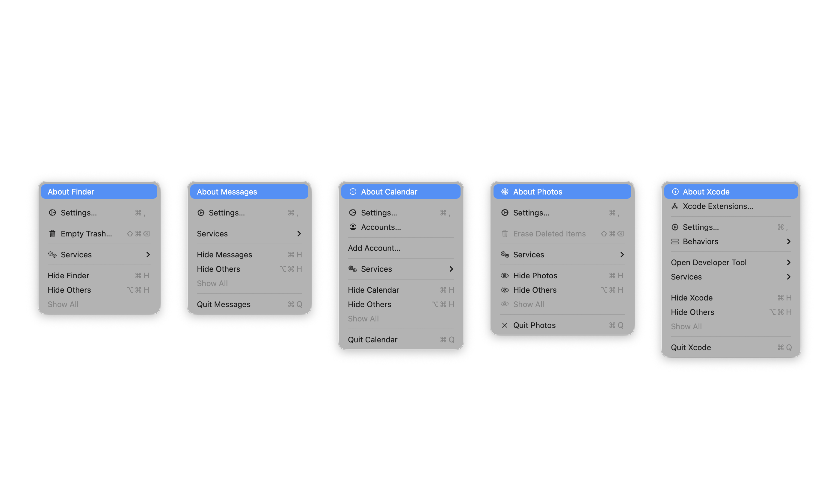
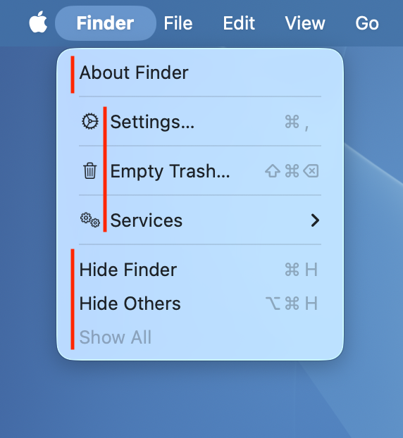
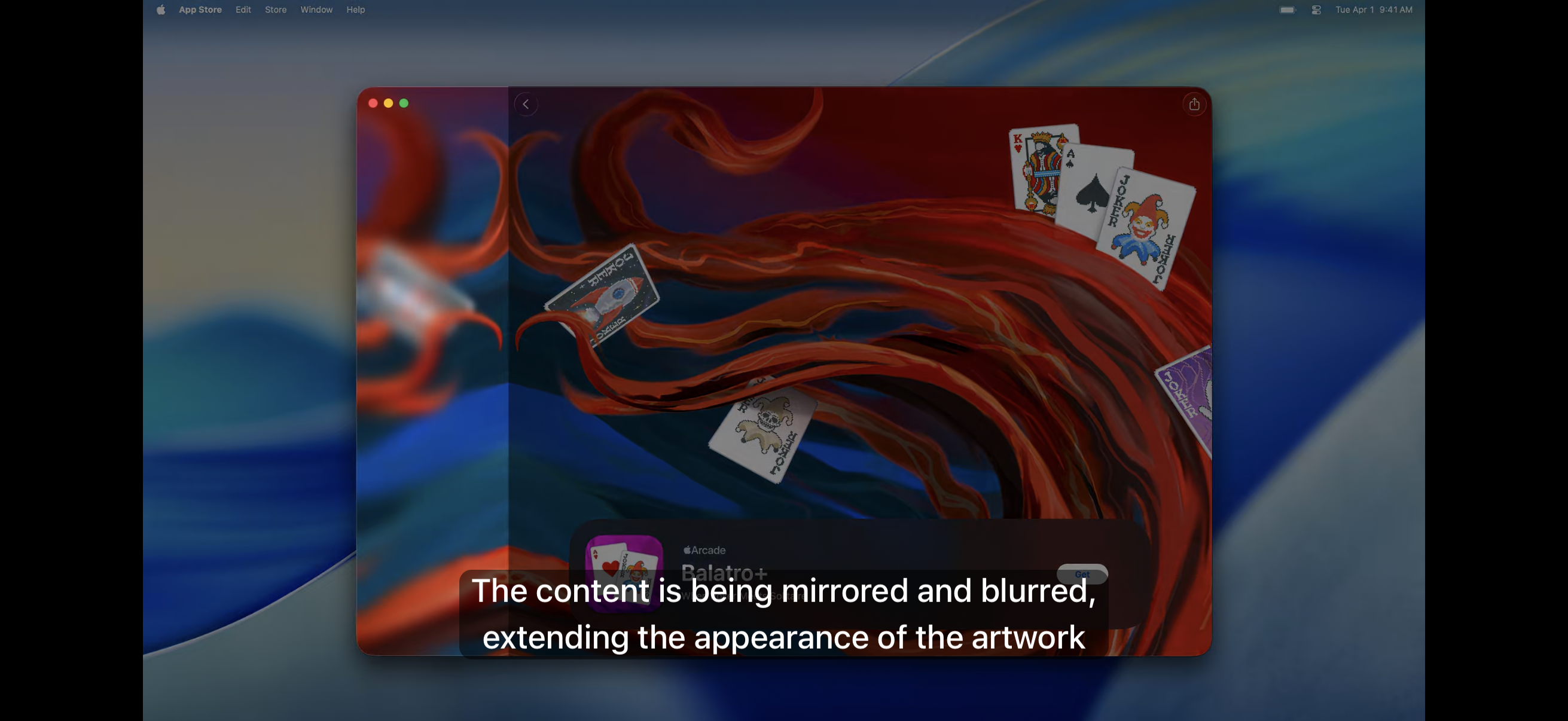
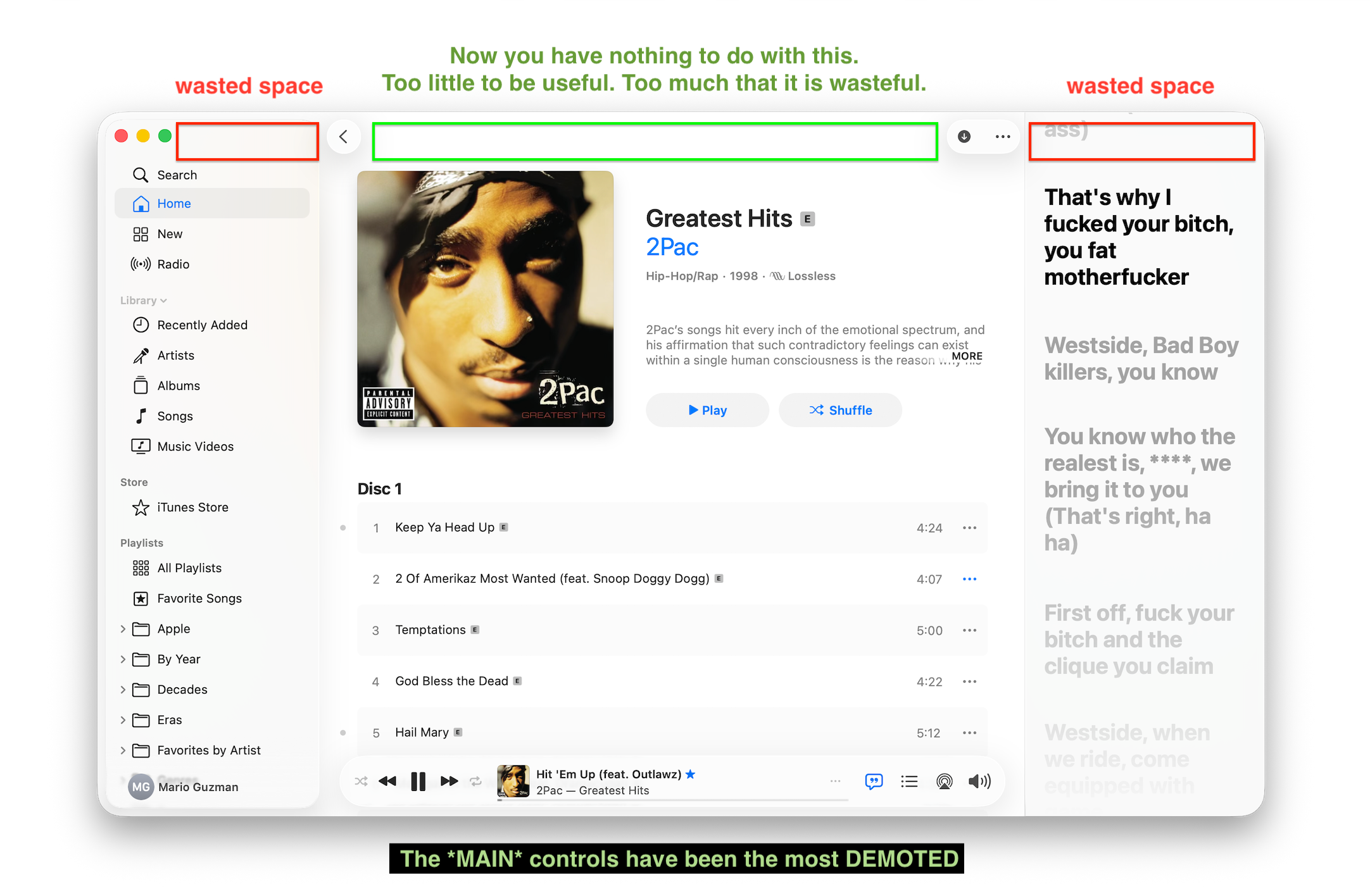
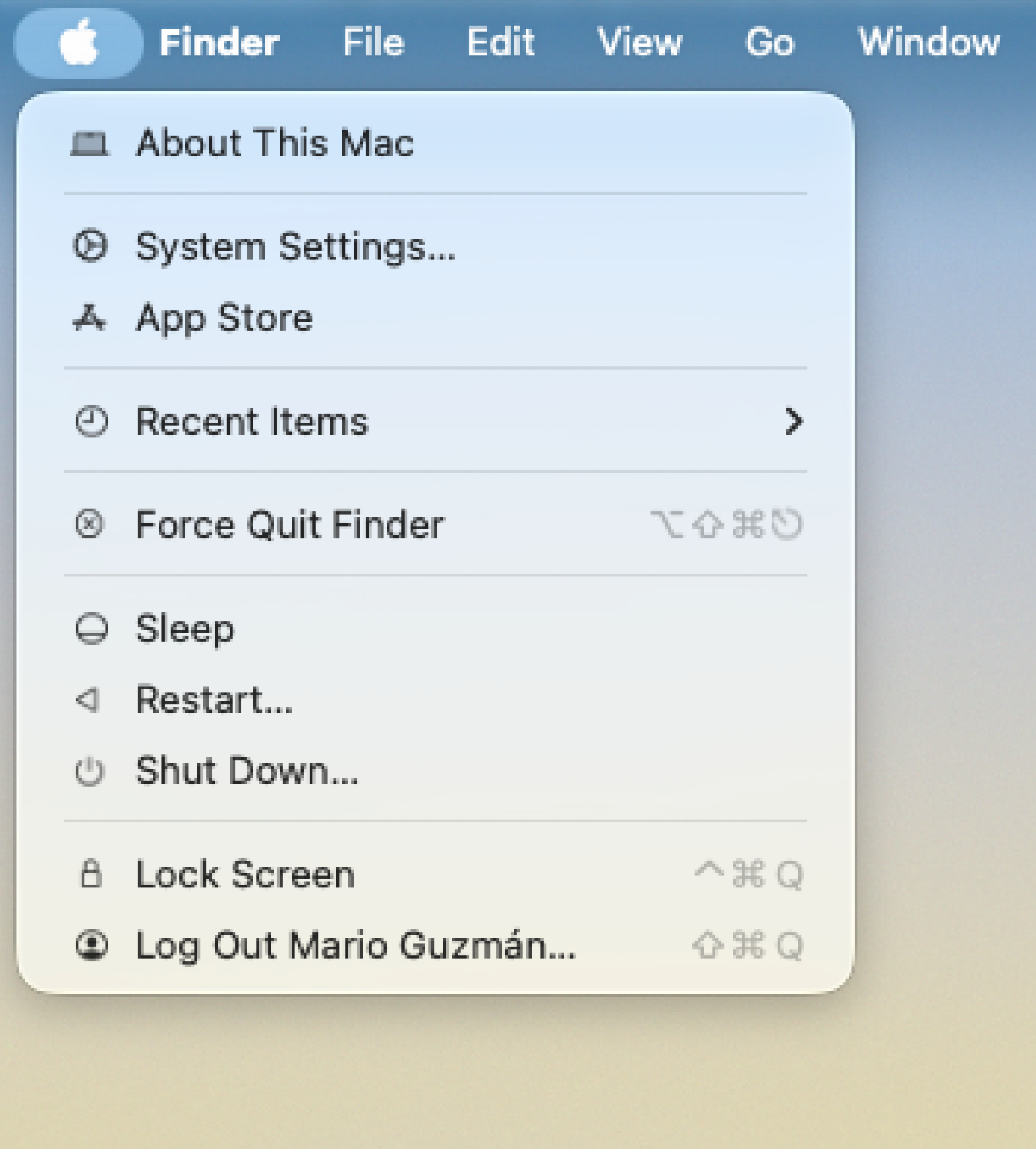
- Please don't put non-squircle icons in a grey box (FB18513307)
to the list.
It's visually unappealing and does a disservice to the designers' work. And since this change isn't due to a technical limitation, non-squircle icons should be supported in #macOSTahoe and future versions.
This is sort of what I was afraid of in #macOSTahoe. There are inconsistencies even with menu items consistent across all apps, like the About... menu item.
Some of Apple's apps don't have an icon. Some do, it is the "i" in a circle. Then you got Photos which luckily has a Photos icon in SF Symbols they can use.
I still maintain icons should only be reserved for contextual menus with only a handful of items OR NSMenuToolbarItem.
Not to mention the jagged labels it causes too...
This is me more and more every day…
I’ve also reported an issue with #Swift URLs created using an URL at `relativeTo:` which can return truncated paths.
It has already been fixed in swift-foundation! This probably means that it finds its way into next #macOSTahoe beta
Apple fixed the Liquid Glass Finder icon in macOS Tahoe Beta 2.
#macos #macos26 #macostahoe #beta2
Alright Apple I wrote a blog post! For anyone who doesn't like how Safari's toolbar changes based on the webpage your on. I have a super simple way to fix it using a Safari Extension.
cc: @marcoarment
https://www.thermalcorner.net/post/fixing-safari-in-macos-tahoe/
It looks like the Now Playing floating view got a bit more opaque in Beta 2. (cc @keir) -- but damn, they're really pushing this. Still not great in terms of legibility.
The most important info bits and controls are getting deemphasized so much with this design. Also now with text up in the toolbar, that is also nearly impossible to see/read.
Finder colors were inverted in Beta 2 #macOSTahoe.
Okay this shouldn't need to be a thing. And its still a work in progress but I might have fixed Safari in macOS Tahoe... Its a simple Safari Extension.
cc: @marcoarment
We have created, for the first time in all history, a [walled] garden of pure ideology—where each [developer] may bloom, secure from the pests of any contradictory thoughts. Our Unification of [Icons] is more powerful a weapon than any fleet or army on earth. We are one people, with one [squircle], one resolve, one cause.
I really need the design team at Apple to think real hard when making new design systems.
Visually stacked items on the Z-Axis does not do you favors when it comes to a 2D display.
You can’t distinguish what elements goes with what view. #macOSTahoe doubles down on layering on the Z-axis more than ever before.
Both Apple and 3rd party devs now have to come up with fixes to address this mess. Like the new NSBackgroundExtensionView in #AppKit.
#UIUX #WWDC25 https://martianbase.net/@mackuba/114684169532147576
Just go back to earlier versions of iTunes. Ignore any ideas of it looking "outdated" — look how all the controls fit nicely on a full-window-width toolbar. Clearly labeled. You will NOT mess up here in using iTunes.
The ONLY thing to lose real estate is by resizing the window; not resizing any sidebars. *THIS* is good/standard design. How did we stray away from such basic UX?
That's the part I don't understand.
AND they used bottom bars too!!! Design that WORKS.
I know, I keep coming back to this. And this isn't about Liquid Glass...
I think we're in this awful state of layouts because of full-height sidebars and compressing the title bar into the toolbar.
Full-height sidebars do not aid in anything. They just serve to eat more of your toolbar space. When you mix that with combining the toolbar with the titlebar -- well you end up with no space at all...
I think this forced Apple Design to moving player controls to the bottom. #UIUX #macOSTahoe
The new floating toolbar buttons are also very distracting. They certainly do keep calling my attention up to the toolbar.
In Big Sur, one thing that bugged me about the new full-height sidebars & inspector sidebars is that they took so much real-estate from toolbars.
Now with chonkier controls everywhere and in toolbars with #macOSTahoe, everything just feels more cluttered on my 14" MacBook Pro.
As you make windows smaller, toolbar controls prematurely get thrown into an overflow menu. I have to remove buttons just to make it more usable these days.
Very dense UI on the Desktop is not a bad thing.